
Stuff+ Modeling
Disclaimer: All data comes from Baseball Savant and MLB Gameday
Introduction
One of the first models I ever built was a Pitching+ model that attempted to quantify the quality of a pitcher’s arsenal using eXtreme Gradient Boosting to predict the likelihood a batter swings and misses on any given pitch. With an increased knowledge in the domain and improving my machine learning techniques, I revised my previous work and am publishing a new, more improved model. Before I delve into my methodology, a little background will help on the purpose of this model.
For those who may not know, in the game of baseball, pitching is one of the most important positions in the game. Their importance makes coaches and fans alike attempt to quantify the position, whether it’s through results based statistics such as ERA and WHIP or pitch level measurables such as pitch velocity and movement. In this article, I attempt to make a generalized metric that quantifies the various pitch measurables into one statistic, Stuff+. I am not the first person to make this metric however, various iterations of the metric have been created, but most are derived from Ethan Moore’s [1] xRV model. In short, this model takes in metrics such as pitch velocity, movement, and release positioning to predict the run value of a pitch. Variations of this model started to surface, including what is called “the standard”, Eno Sarris’ [2] Stuff+ model. This model adds on to the xRV model with the introduction of a couple new features: velocity and movement differential and axis deviation. No worries if you don’t understand what those terms mean, I will only be explaning the ones I use thoroughly in my model.
Methodology
Data Description: The data I decided to use for this model is courtesy to Baseball Savant and MLB Gameday. Baseball Savant provides the pitch level data required to train the model and MLB Gameday provides some game context information that can influence a pitch. I decided to collect data from the 2020 to 2023 MLB seasons to train and evaluate the model on. The reason why I started with 2020 is because of the introduction of the Hawk-Eye pitch tracking system [3][4], which uses computer vision to track pitch data in a precise manner, even better than Trackman. MLB Gameday provides game information data including the home and away team, the venue information, and weather data. These could be useful features to provide context of the elements that could be affecting the pitch.
Data Manipulation: I didn’t have to do much data manipulation or cleaning since the Baseball Savant CSV profile is presented in a nice, clean format with little error. What I did was converted the left handed x-coordinate metrics to a right handed presentation so the model doesn’t get confused and fit to a particular handedness of a pitcher. The other thing I did was filter out pitches that are obscure and meaningless to the model such as an Eephus or Pitch Out.
Feature Selection
The features I selected for this model are as follows:
release_speed: The velocity of the pitch at the time the pitcher releases the ball.release_pos_x: The x-coordinate of a pitcher’s release position.release_pos_z: The z-coordinate of a pitcher’s release position. Think vertical positioning in a 2D plane.pfx_x: The horizontal break of a pitch.pfx_z: The vertical break of a pitch.release_spin_rate: The number of rotations are inflicted on the baseball through it’s flight to the catcher.release_extension: How far out the pitcher extends their arm before releasing the ball.venue_elevation: The elevation of the stadium.ssw_x: The approximate non-Magnus horizontal break of a pitch.ssw_z: The approximate non-Magnus vertical break of a pitch.
You may be wondering why I have the elevation of the stadium in as a feature. I mainly have it in as a joke directed towards Trevor Bauer as he complains about these models not including the elevation 😉.
One feature you may notice I don’t have is the velocity and movement differences for each pitcher’s fastball, a commonly used feature [2][4]. Personally, I see issues with sampling bias within the dataset. For example, Clayton Kershaw’s fastball velocity has been on the decline going from 91.6 in 2020 to 90.7 in 2023. It doesn’t seem fair to include his declined metrics in the 2020 season when he was younger and healthier. To combat this, I tried treating each pitcher’s velocity and movement on a year-by-year basis but the issue with this is rookies are going to naturally have lower scores as their differences would be NA. Ultimately, I scrapped this feature and focused on treating each pitch as independent of each other. There are some flaws with this approach such as rejecting the idea that pitches aren’t thrown in a sequence, which is inherently false, but I think having individual pitch characteristics included instead of a grouping helps prevent the model from favoring certain pitchers. It doesn’t prevent the other flaw however, which is favoring certain pitches.
If you want to hear more information on ssw_x and ssw_z, please see the Seam Shifted Wake section. If you are not interested in that, then feel free to move on to the Building the Model section.
Seam Shifted Wake
I am dedicating this section to talk more in depth on Seam Shifted Wake as I think it’s an important one to discuss.
When an object, specifically a smooth ball, is thrown, it’s spin displaces the air causing a force to act upon it’s movement. This force is called the Magnus Effect shown in Figure 1.
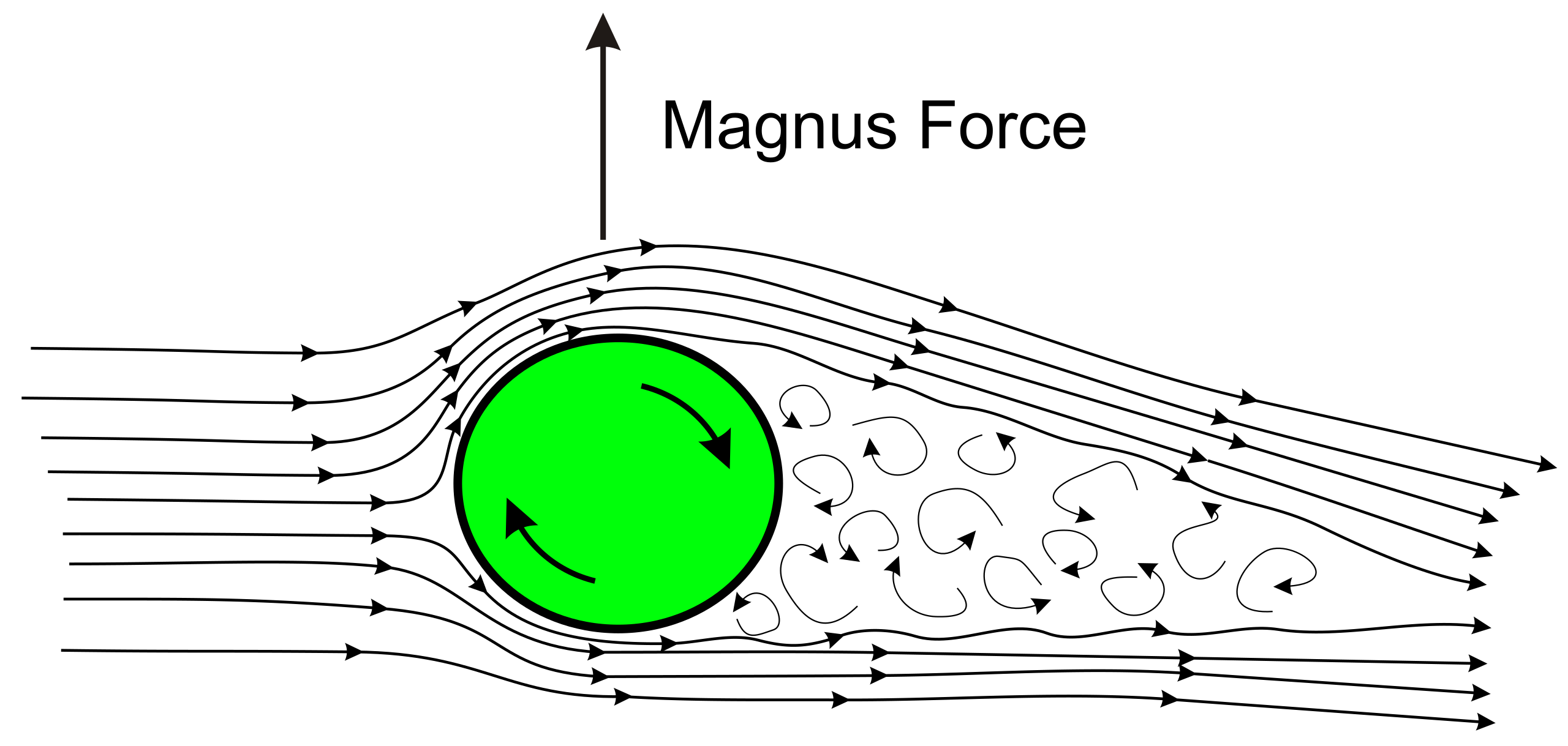
Image Source: https://projectair.co.uk/blogs/simple-aerodynamics/how-magnus-effect-can-lift-planes
Let’s say a fastball is thrown with the smooth ball. The ball creates backspin where the air on top of it moves much more smoothly, creating lower pressure. The air on the bottom is creating more friction and thus higher pressure. This pressure difference creates lift in the force of the object. That’s why fastballs tend to do better at resisting gravity than a curveball, which has more topspin. Let’s put some seams on the ball now. Something interesting happens. If you orient the seams in such a way that the pitch isn’t spinning super efficiently (70-90%) in the direction of the catcher, an effect called gyrospin appears. This gyrospin creates more movement on the pitch in addition to the spin based movement, which can be more deceptive to the batter’s eye. This phenomena in baseball terminology is called Seam Shifted Wake. That is essentially all you need to know about Seam Shifted Wake, but if you want to learn more, I will link Dr. Barton Smith’s paper on this subject matter.
Deriving this metric takes a lot of physics knowledge I don’t have. Luckily, Dr. Alan Nathan [5] has already done this for us. Some of you might notice that I didn’t use axis deviation for the model. The reason for this is axis deviation has a sweet spot [6], rather than following a linear trend. This could hinder the predictiveness of the model. Instead, I used the approximate non-Magnus horizontal and vertical movement. This can be applied into what is shown in Figure 2.
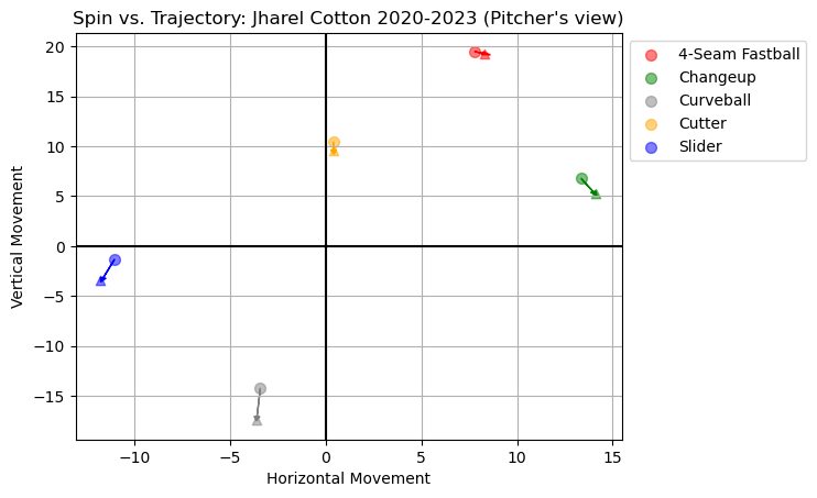
Jharel Cotton is a right-handed pitcher who has a 4-seam fastball that is percieved to “rise”. While that is not true, as every pitch falls with gravity, the non-Magnus effect of the pitch is consistent with the Magnus, creating the illusion the ball rises. If you look at his other pitches, sliders and curveballs tend to break gloveside and down while his changeup breaks down and armside. While these points don’t appear to be significant, baseball is a game of inches and every inch a pitcher gains can be the difference between a swing and a miss or a home run.
Building the Model
With the features set in place, it’s time to create a model. I am using the same target I did in my previous article, whiffs. Whiffs are a good metric since it isn’t influenced by factors the pitcher can’t control. It focuses on the characteristics of a pitch that generate a swing and miss.
I tested out 4 different models: A base model that predicts every pitch to be a whiff at 11% (the proportion of whiffs in the dataset), an eXtreme Gradient Boosting Model, a CatBoost Model, and Tuned CatBoost Model. I used logloss, auc, brier score, and recall as my evaluation metrics to better evaluate the imbalanced distribution of whiffs. The results are shown in Table 1.
| Model | Logloss | AUC | Brier Score | Recall |
|---|---|---|---|---|
| Base | 0.352 | 0.5 | 0.1 | 0.887 |
| XGBoost | 0.343 | 0.625 | 0.098 | 0.887 |
| CatBoost | 0.343 | 0.625 | 0.098 | 0.887 |
| CatBoost Tuned | 0.342 | 0.627 | 0.098 | 0.887 |
While the differences are very miniscule, the tuned CatBoost model was the best performing model overall. It’s promising that the AUC for the model is over 0.5, which means it’s better than making a 50-50 guess on whether a pitch was or was not a whiff. The only metric that draws for concern is recall not increasing, meaning these models weren’t able to significantly predict more true whiffs when compared to the base.
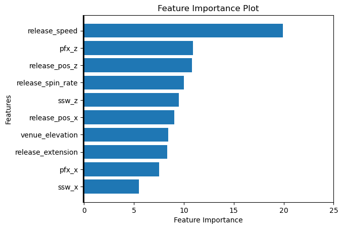
Figure 3 displays the importance or prediction value changes of each feature. This metric shows on average how much the prediction changes if the feature value changes. The bigger the value, the bigger the change.
Stuff+ Calculation
We are almost to the fun part. Just a few more math calculations to go. The first part I’ll cover is how to compute Stuff+. Stuff+ is supposed to be approximately normally distributed with a mean of 100 and standard deviation of 10, at least that is the common agreement amongst creators of the metric. I follow suit on this principle, deriving the value with the following formula:
Stuff+ = 100 + (zscore * 10)With this in mind, I want to check a few things before I display leaderboards.
Stickiness: Stickiness is defined as how predictive the Stuff+ value is year to year [2]. In theory, this metric should be consistent for each pitcher since their pitch aresenal shouldn’t drastically deviate each year. Let’s see how Figure 4 puts that to the test.
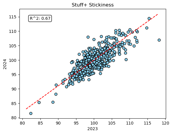
It passed!! With an R2 score of 67%, that means 67% of the variability in Stuff+ from year to year can be explained by the model.
Distribution: The second test this model should pass is being approximately normally distributed. Figure 5 can help explain this.
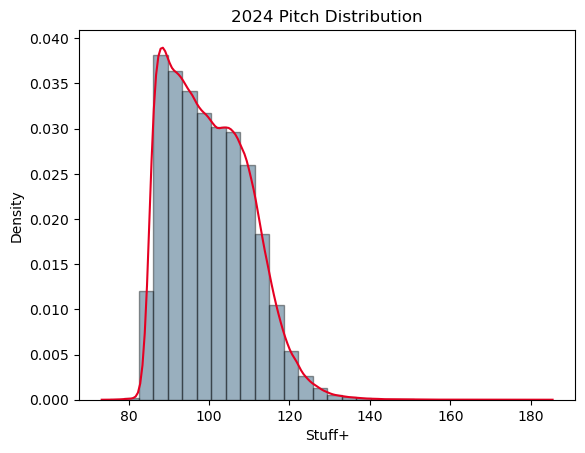
Unfortunately, my version of Stuff+ is not normally distributed. The Shapiro-Wilk test for normality further confirmed this with a p-value being less than 0.05, rejecting the null-hypothesis, and further concluding that the distribution significantly deviates from normal. I am a little upset about this result and brings up some flaws, but this will be explained in the Limitations section.
Summary Statistics: Table 2 shows the summary statistics for each pitch type in 2024.
| Stuff+ Descrpitive Statistics | ||
|---|---|---|
| Pitch Type | Average | Standard Deviation |
| Sinker | 90 | 4.9 |
| Fastball | 95 | 6.4 |
| Cutter | 102 | 7.4 |
| Slurve | 102 | 6.8 |
| Curveball | 103 | 8.7 |
| Changeup | 106 | 8.8 |
| Sweeper | 107 | 7.3 |
| Knuckle Curve | 108 | 10.1 |
| Split-Finger | 109 | 8.7 |
| Slider | 109 | 7.3 |
The model found fastballs and sinkers to not be whiff producing pitches which makes sense as these are pitches that are typically used for setting up an offspeed pitch or used to get the batter to put the ball in play for an out.
Predictiveness and Descriptiveness: I’ve already shown that Stuff+ is a sticky metric, but how does it compare with other MLB stats? Table 3 provides the correlations between the metric and other MLB stats (Min 100 pitches thrown).
| 2024 ERA | 2024 FIP | 2024 K-BB% | |
|---|---|---|---|
| 2023 Stuff+ | -0.092 | -0.113 | 0.284 |
| 2024 Stuff+ | -0.108 | -0.196 | 0.338 |
When looking for predictiveness (2023 vs. 2024), ideally you want to see high correlated values. While this metric is predictive in a sense that it can predict individual pitcher’s Stuff+ year to year, it struggles to do so with other metrics we use to evaluate pitchers. When looking for descrpitiveness (2024 vs. 2024), you want to see the correlations be higher than the predictive correlations, which they are. My iteration of Stuff+ best predicts and describes K-BB%, which is good since this metric has a strong relationship with teams winning games. However, it is worth mentioning this model does not outperform other public models with predictiveness and descriptiveness which is unfortunate.
2024 Implementation
I’ve done a lot of explaining and evaluating my model. I wanted to dedicate this section on the Stuff+ leaders for the 2024 season. Figure 6 below shows the top 10 qualified Starting Pitchers based on their Stuff+ scores.
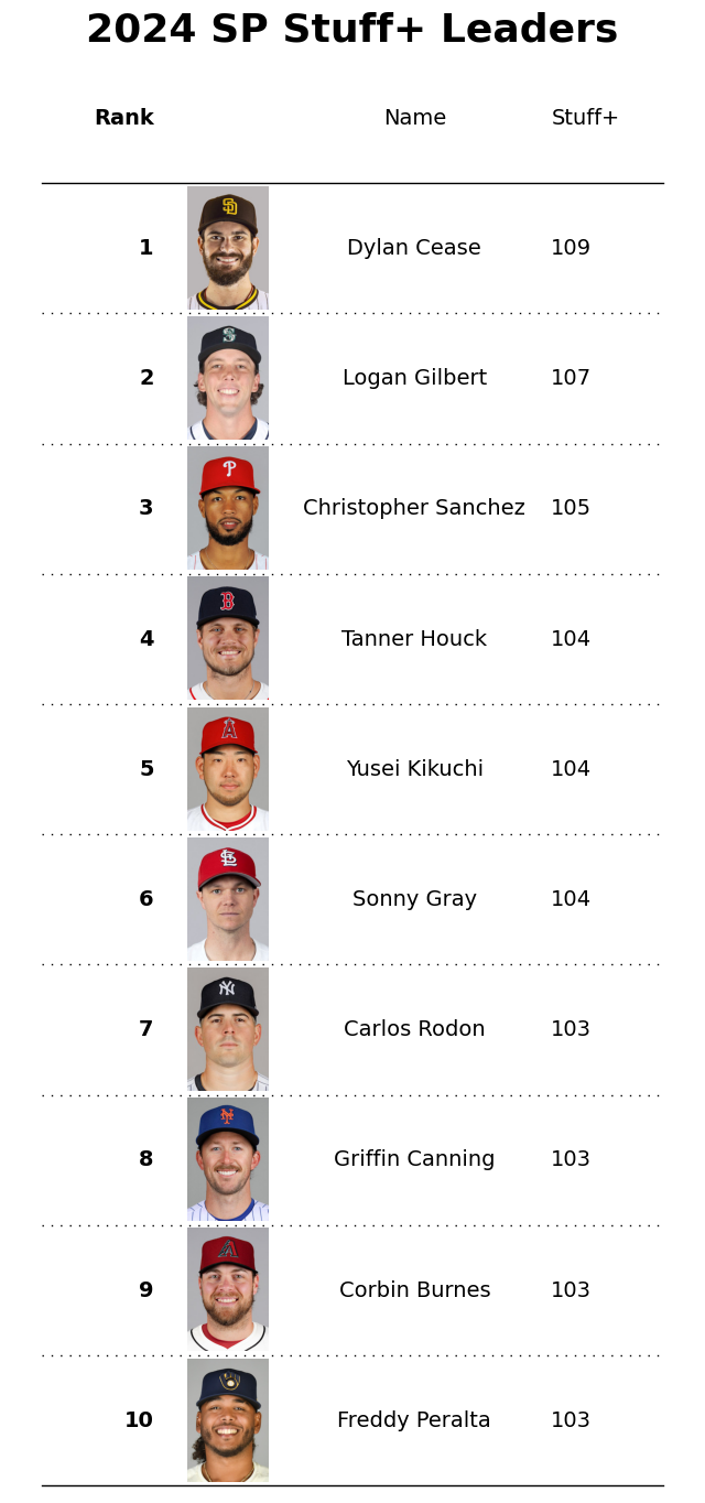
Dylan Cease finishes at the top for the 2024 season with a Stuff+ of 109. This means on average, his pitch aresenal is 9% better than the average pitcher. The last thing I investegated was what the best pitch was. That honor goes to a Luis Castillo slider thrown to Charlie Blackmon for a foul ball. The pitch registered with a 183 Stuff+ value. An awesome job on Blackmon’s part fouling the pitch off.
Limitations
I was dreading writing this part but alas, it is here. Every project comes with it’s limitations, this one is unfortunately no exception. I think what really hindered this metric is the imbalanced nature of whiffs, leading to a non-normal distribution. A way to combat this are using more predictive features such as the count. Another way would be substituting run value for whiffs or another metric for the target. The solution I’m trying to go for here is finding better features that minimize the logloss so the model doesn’t make a conservative guess towards a pitch (close to 0.11), leading to skewness in the output probabilities. There are ways to combat skewness such as taking the log of the probabilities, but I ultimately decided against it as it takes away the purpose of the output probabilities. Lastly, treating pitches as a sequence can help improve the model. I personally think this is the most influential limitation as pitches are thrown with the intent to build off one another in the at-bat. I did not have time to figure out a way to compile sequences, but am aware of resources for pitch sequencing [7]. This can help certain pitches such as fastballs that were low in my metric since they are typically used as setup pitches for offspeed to generate more whiffs.
Conclusion
There were a lot of other visializations and analysis I left out in this blog just for the sake of time. It had fun taking a deep dive into this metric and attempting to create my own. While this model doesn’t add much value to the metric, I hope you as the reader can take something away from this post, whether it was how to build and analyze a model or learning about a newer metric. I don’t think I will be keeping up with this metric due to the inherent flaws, but depending on what I’m motivated in modeling, I may take a deeper look into pitch sequencing. Feel free to leave a comment below if you think there is value I can add to the model.
References
[1] Ethan Moore xRV: https://medium.com/something-tangible/measuring-pitch-quality-590043713e74
[2] Eno Sarris Stuff+: https://library.fangraphs.com/pitching/stuff-location-and-pitching-primer/
[3] Hawk-Eye News Report: https://www.prnewswire.com/news-releases/hawk-eye-innovations-and-mlb-introduce-next-gen-baseball-tracking-and-analytics-platform-301115828.html
[4] tjStuff+: https://medium.com/@thomasjamesnestico/modelling-tjstuff-d9a451765484
[5] Alan Nathan SSW Calculation: https://baseball.physics.illinois.edu/HawkeyeSpinAnalysis-Part%20I-rev1.pdf
[6] Baseball Prospectus SSW Interpretation: https://www.baseballprospectus.com/news/article/74601/climbing-the-ladder-were-talking-about-seam-shifted-wake-wrong-axis-deviation/
[7] Pitch Sequencing: https://www.prospectslive.com/prospects-live/2023/12/25/introducing-sequencing-a-strategy-based-metric-measuring-pitch-sequencing
I was a little lazy with this. Since I’m not publishing officially, I’m just leaving links to sources and not making citations :)